Exclusive Interview with Kai Carpenter, 3rd Prize Winner, INPRNT Traditional Art Award, 2020 Beautiful Bizarre Art Prize
At one point in our not too distant collective past, we mastered the fine art of leaving our worldly cares at the doorstep in order to triple somersault through the escapism threshold. That has – and likely will always be – a reliable coping mechanism for mortals who encounter speedbumps along the journey of life. In 2020, our apparently somewhat sinister (and occasionally snickering) universe had other plans for us. Far too many of the creature comforts that we had grown to love – and quite frankly, had taken for granted – were heartlessly yanked from our white-knuckled hands.
- Live music? Gone!
- Closing down the bar with our bestest slurring-spitting buddy “Slillll-vleeeeeeee-ahhhh” (with a smiley face dotting the i)? Not a chance.
- Meandering through a good-excuse-for-an-anything-festival while sampling tasty morsels of who cares what it is…it’s free!? Are you out of your bloody, potentially COVID-cootie-infected skull?
In the compulsively Twinkie-chomping downward spiral known as our lockdown reality, there is one thing that helped all of us to soothe the savage, stir-crazy beast. Gorging on Kai Carpenter’s art! And what an addictive yet thankfully calorie-free relief it has been.
Wha-why are you telling me this now? Of course you received the internal memo. Yes, exactly… his name is pronounced “Kai”, as in “why” don’t you ever read the messages that I send you any more? Maybe you’ll recall the subject line:
Free-For-All, No-Holds-Barred Kai Carpenter Ocular Boooofayyy
Yup, it was an invitation to partake in a virtual Kai-eye fantasy art fest. Indeed…served up in unlimited quantities by the newly dubbed winner of one of Beautiful Bizarre Magazine’s 2020 Art Prizes. Mm-hmm, the illustrator and oil painter hails from Seattle. Sure… I’ve heard that it really does rain there like every 15 minutes or so, but you’d really have to ask…
Huh-boy. Let’s refocus. It’s pretty dandy that your sprained but still functioning scrolling finger led you to this article. Better late than never. This is all you really need to know. The next time you feel as though your asteroid-dodging, stop-drop-and-roll skills are hanging on by a thread, do just one thing. Recharge your mind, body and soul by taking a nose dive into Kai Carpenter’s portfolio. You just may find yourself leaning a bit more on the sumptuously sweet refuge of his fantastically illustrated fables than on the latest apocalypse-resilient (ahem… desperation-reversing) snack cake du jour. Oh yes! And by all means… please do pull up a seat and chow down on this delectable ‘interview buffet’ with the man, the myth, and the Twinkie-crumpling legend himself.
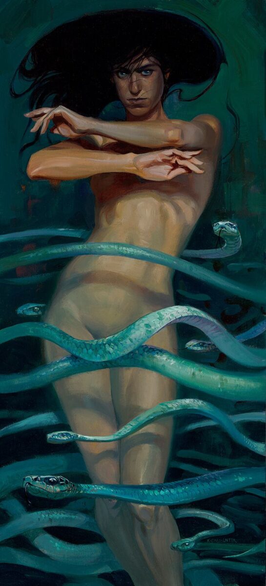
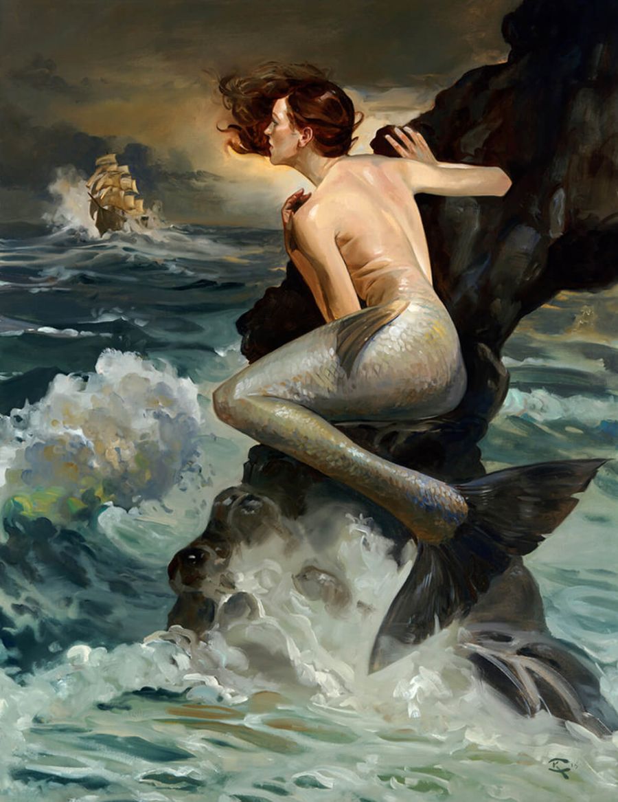
These figures are threatening and alluring, in part because of their kinship with the sea. That’s a place that inevitably returns in dreams and mythology to remind us of our deeper, unknown selves.
Interview with Kai Carpenter by Elizah Leigh
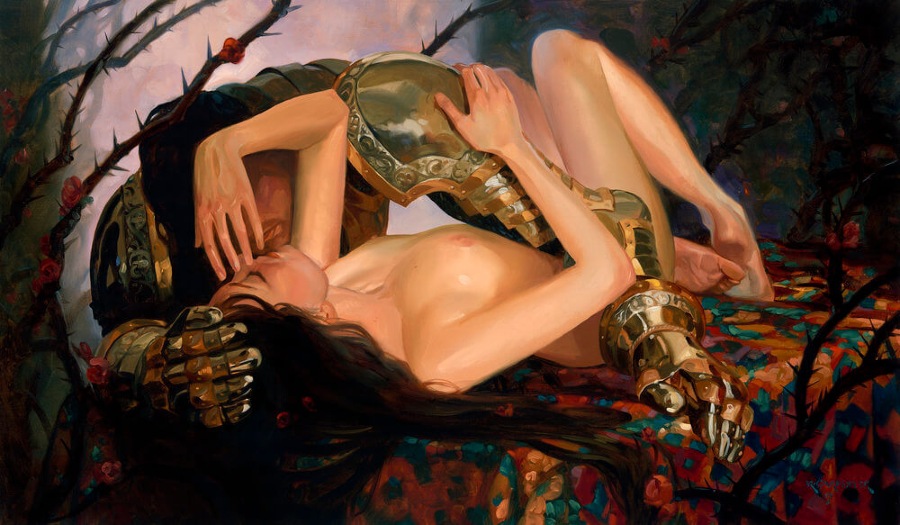
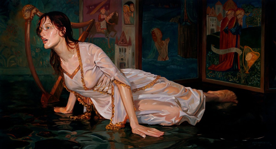
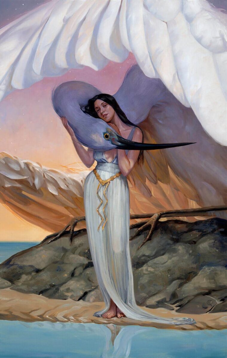
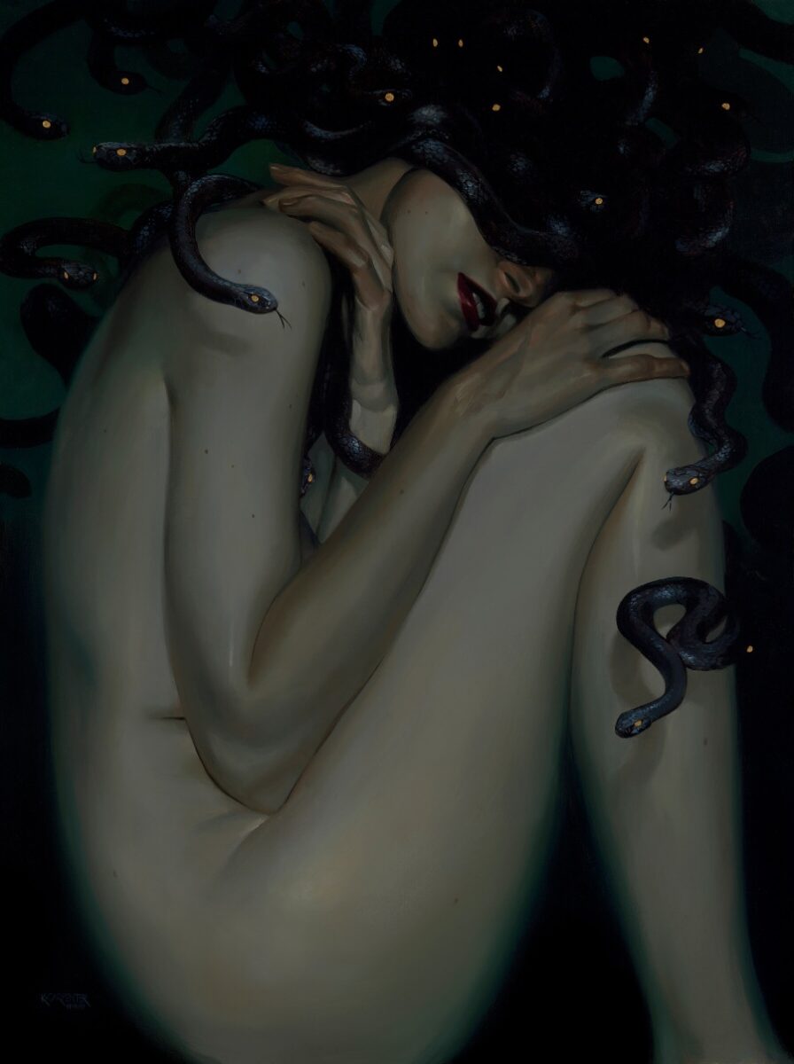
Congratulations, Kai! Beautiful Bizarre Magazine is honored to bestow you with this year’s 3rd prize in the INPRNT Traditional Art Award category for your luminous oil painting, The Selkie. You handily take the reins from your 2019 predecessor, Adrienne Stein, by perpetuating the enviable tradition of rendering a seductively sublime muse. How does it feel to win your first international art award?
Quite surprising! You mention Adrienne Stein, who is such an excellent painter and one of my favorites these days. She’s indicative of the kind of stellar quality work that you can find in figurative art right now. I have been overwhelmed and honored that The Selkie has garnered such a warm response.
In the Scots language, the title of your oil painting means grey seal or seal folk. You mentioned that your winning image is inspired by the skin-shedding seal-humans found in Scottish folktales. Do you have British blood coursing through your veins or are you simply just an anglophile with great affection for obscure Gaelic stories?
Well, I probably do have some Scots blood – of course, as an American, it’s hard to say. It comes down to storytelling, and folklore is my favorite source. There’s a poetic quality to old and magical stories. They open new connections in the minds of artists and viewers, even today. I find these kinds of myths to be very fertile ground for my work.
The flesh of your shapeshifting muse is marvelously melty and seems to be sizzling with heat. Was your life model extraordinarily hydrated, or is your selkie’s skin solely the result of oil-on-canvas alchemy?
I sought to achieve a sense of intimacy and immediacy, as though the beholder could actually be a participant in this scene. That required that I pay greater attention to texture. More and more, I find myself drawn to the nuanced passages of skin texture, such as sheen, color, and shadow. I think those aspects can make a painting feel exceedingly intimate. I strive to create that effect, particularly when the painting is nearly life-sized (which The Selkie certainly is).
As was the case with Rome, The Selkie clearly wasn’t built in a day. What process did you use to create such luminescent, water-drenched flesh?
Beyond studying the effects of water on skin, I was really excited to explore the potential color variation in the subject. The color of flesh fluctuates and is subjective. That is even more apparent when flesh is wet and luminous with reflection. I did a lot of color sketching to figure out how to push those tones into a far more opalescent range.

Your painting convincingly heaves with life in a way that is almost jarring; the good kind of jarring. If you were trying to summon the idea of the almighty life-giving yet still destructive power of the ocean, cheers for a job well done. Do I detect a Promethean Victor Frankenstein vibe woven into the essence of The Selkie?
I actually had just finished reading Frankenstein before painting this, so I’m going to say a big fat YES to that! In her lore, the danger and ambiguity of The Selkie is largely what makes the story potent, I think. She’s a witch, and we all know you shouldn’t mess with them. Of course, messing with them is precisely what the folklore is about. These figures are threatening and alluring, in part because of their kinship with the sea. That’s a place that inevitably returns in dreams and mythology to remind us of our deeper, unknown selves. There’s beauty there, but also a terrifying otherness and magic that makes the ocean and its inhabitants sublime, awesome, yet also quite scary. Still, we recognize the sea as our origin, our fertile place of birth. There’s a temptation and danger there that folklore distills very succinctly.
I think beauty itself is a feeling, and glamour is a feeling.
The fantasy art genre is unquestionably your domain. You’re also drawn to the vintage-y aesthetic of early-20th century art. While both visual styles are quite different, do they appeal to you mainly because of the transcendent feeling that each type of imagery generates?
I think beauty itself is a feeling, and glamour is a feeling. Those are two things that 20th century figurative artists excelled at generating within their works. Those artists teach us a lot about distilling an image into something that touches a very specific part of our experience. There is beauty to be found in a moment of storytelling or abstract visual identity. Simply recognizing the human hand present in a handmade work of art is beautiful. Concurrent with the rise of photography, artists grappled with what makes a handmade work of art distinct from a photographic record of our world. To this day, contemporary creatives still do.
Do illustrators typically paint with oils or are you one of the rare few? How did that become your favored medium?
Well, there’s certainly a long history of it, but in our time, oils have developed a bit of a reputation for being sort of antiquated, or slow, fussy, academic, etc. It’s not the first thing most young artists think of when they think of figurative illustration. When you study the mid-century illustrators, you realize that oils are actually quite versatile and even accessible. I started working in oils pretty early on in my illustration career when I was trying to get my then-medium of choice, gouache, to dry slower. Eventually, I realized that I was trying to coax gouache to do something that wasn’t inherent to that medium. I essentially switched over to oils so I could get the longer working time that I needed.
Last year on your Instagram account, you offered fans a glimpse of how you created one of the covers for DC Comics’ The Last God. You posted a fairly detailed pencil sketch of your cover concept alongside a rough color sketch and finally the polished oil painting. Whether you work on a comic book cover, a travel poster, or a fine art image, do you adhere to that general blueprint each time?
Yep. Ideally, each stage is a chance to discover more about the subject.
You created all 23 covers for DC Comics’ rebooted dark fantasy series, The Books of Magic, which wrapped up in September 2020. The Black Label imprint that you worked on was based on Neil Gaiman’s four issue prestige series, published in 1993 under the DC Comics/Vertigo umbrella. Since the British author is known to personally select writing teams for many of his spin-off projects, did he also handpick you to be DC Comics’ The Books of Magic cover artist?
You know, I’m not sure – I do know that he did have say in that choice. Those exciting initial e-mails that I received about working on the series were from my soon-to-be art director at DC, rather than Neil himself.
Did corporate bigwigs at DC Comics make you jump through illustration hoops to prove that you were worthy enough to don your cover artist hat? What did you have to do to seal the deal?
Actually, that’s a neat little story that harkens way back to the start of my career. I attended the Comic-Con in San Diego and was fortunate enough to encounter Mark Chiarello and Mark Doyle of DC Comics. They gave me some really great criticism and feedback on my art. They also asked me to stay in touch. I did, but my updates became less frequent as I took on other projects, other directions, etc. Seven or so years later, I was reviewing old contacts. I decided to share some of the new work I’d been making with Mark. He replied immediately. He ended up passing my name along to the art director who was putting together a team for Neil’s series. Ultimately, it just seemed to strike everyone as a good fit.
People really do judge a book by its cover, whether novel, short story or comic. Was being in charge of the aesthetic for a series from a highly acclaimed New York Times Bestselling author a little daunting? Did you do any preparatory work to rise to the occasion?
When you’re making comic covers, the interior art and writing for the series are a great source of inspiration. In this case, both were excellent. It’s really nice to be able to feed off of that creative team vibe. Otherwise, it might seem like a lot to figure out on your own. I love Neil Gaiman’s work in general, and I loved his original comic series. Right from the start, I wanted to bring my highest-caliber work to that cover run. It definitely challenged me in new ways. For example, I learned how to streamline my process and also simplify my compositions, among various other things. Once I cleared those hurdles a few times, I gained more confidence and settled into my role.
At any point throughout your work on The Books of Magic, did Neil ever offer you illustration notes? Perhaps a congratulatory high five? Is he the type to send a “way to go!” fruit bouquet to his favorite artists?
He might be! A few times, he actually did pass on some congratulatory notes through my art directors. It definitely felt good to have my work reposted by him. Early on in the illustration process, Neil did offer feedback. He said that the character of Timothy Hunter looked just a touch too old in one of my paintings. He asked me to fill out his cheeks a tad bit so that he would look slightly more youthful. I appreciated that he was quite engaged with the process and cared a lot about those details.
All 11 covers of DC Comics’ The Last God were also created by you, a series that will presumably be continuing in the months ahead. Your art also graces the front of their 40-page Dungeons & Dragons sourcebook, The Last God: Tales from The Book of Ages. Do you feel like an old pro at this point? If you scored a gig as the cover artist for My Rainbow Pony: The Zombie Generation, would you be able to breezily illustrate it while mastering Mandarin?
How did you know I was working on that?! The thing that I’ve enjoyed most about these cover runs is that they show you new ways to improve. For The Last God, I was making covers that graced Riccardo Federici’s illustrated pages. He is insanely talented. Insanely. His work is a huge inspiration to me. Being in charge of making cover art that served as a doorway to his absolutely top-notch art was daunting. Nonetheless, it was also very inspiring. It helped me figure out how to up my game.
Is it highly unusual for an aspiring illustrator to score their first official freelance job while attending the San Diego Comic-Con? Are you among the many shrewd artists who have used a geek-a-thon ticket as a career-launching strategy?
There’s a long and distinguished history of artists doing that, but I had no idea it would work out for me in quite that way! I was fortunate that a couple of more seasoned friends – Claire Hummel and Nick Kole, in particular – showed me the ropes. I hope that global comic cons continue to support young and seasoned artists alike for years to come, as my first cons did for me.
Six years ago, it seems like you employed a similar resourceful approach in order to secure Golden Age-quality illustration work. You conducted research and targeted specific companies. Ultimately, you found what continues to be a very fruitful artistic relationship with Anderson Design Group. Did you do anything outside of the box to give yourself more of an edge over your competition?
We really got along from the get-go, but it also happened to be a fortuitous situation. Joel Anderson was looking for a certain kind of work, and I was looking for someone to do that work for. We found each other and got right to it. It did end up being a great example of how effective basic research can be for an artist. Doors can open if you find out who is doing the kind of work that you want to be making and then you just reach out to them. Of course, pouring great enthusiasm into those projects certainly helps. I was working very hard on my figure work and my oil techniques, so things like that fed directly into the art that we both wanted to make. It was a good fit and a lot of fun.
I think that a person is an event. I want to paint people that way, which really demands that my images are grounded in a real-life experience.
You’ve created well over 100 different works of vintage-flavored travel art for Anderson Design Group. They’ve dubbed your illustrative series the “Kai Carpenter Collection” on their website. Your visuals are emblazoned on posters, banners, puzzles, calendars and postcards. They’re even bound within a 128-page hardcover “Art of Kai Carpenter” book! At what point did you stop pinching yourself? When did you officially recognize that you really had achieved the dream that so many creatives strive for?
I still do pinch myself! I love that body of work, and the fact that it resonates so strongly with people feels very powerful to me. The love that Joel and I both poured into all that art really comes through, which makes me so happy. I still do get a kick out of seeing my paintings printed on little National Parks stickers adorning muddy bumpers. It’s so touching to know that someone chose that image to symbolize their experience of that special place.
At the beginning of each illustration project that you take on, you regularly use live models. How did this become the go-to method that helps you to achieve your desired artistic composition?
I think that a person is an event. I want to paint people that way, which really demands that my images are grounded in a real-life experience. Obviously, one needn’t slavishly copy one’s reference. There is always unexpected inspiration to be found in ‘the other,’ whoever that is. Real models bring features and gestures and thoughts to the table that I would never think of. I’m more honest and attentive when I pay attention to what really makes a person look like them. Then I critically compare that to what the painting needs. Plus, it’s fun to think about just the right person to achieve a look or feeling you’re going for.
I discovered early on – in The Books of Magic run – that I didn’t have teenage friends to sketch in the poses that I needed. Instead of reimagining my adult male friends or male models as a teenage boy, I ended up basing the Timothy Hunter character on my friend Leela. I never would have predicted that.
You transformed your real-life, 2% body fat brother, Ridge, into the Kraken-wrapped protagonist emblazoned on DC Vertigo’s Hellblazer: The Laughing Magician paperback. Was he an agreeable muse, or did he furnish you with a no brown M&Ms backstage rider?
Hah! RIP Eddie Van Halen. But yes, Ridge was agreeable! As a strength professional, he’s got a ton of body awareness, plus he is also an artist. Additionally, he used to work as an art model, so he’s actually modeled for me a lot. Over the years, my brothers have put up with a lot of this for me, bless their hearts.
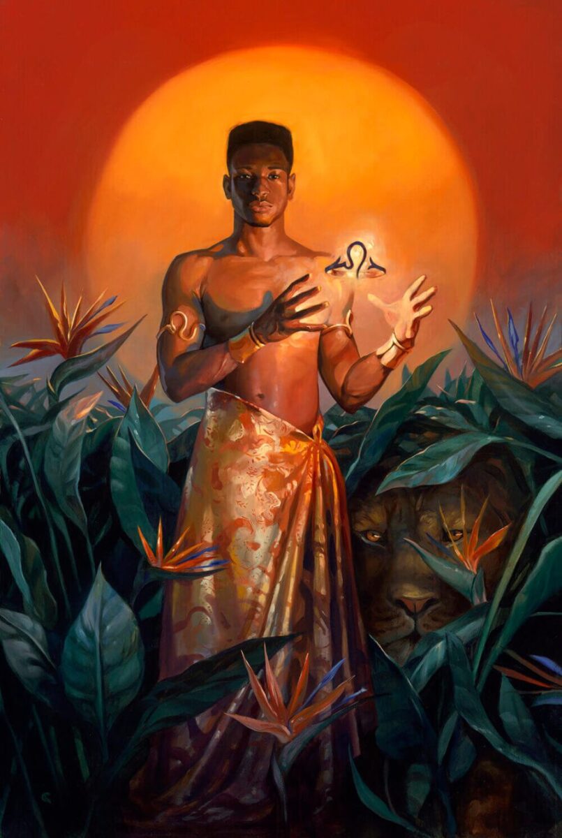
You’ve also used muse-friends on occasion. You transformed fellow RISD illustrator/painter Odera Igbokwe into Sagittarius for your 2020 Llewellyn Astrology Calendar. Is the fact that you based your leaping archer concept on Odera rather than through another means somewhat unusual? Do your artwork concepts typically materialize quite differently?
Actually, it was a little unusual in that I never base ideas on a specific person or personality. Nonetheless, I was thinking about Odera when I first sketched that image, and they were 100% the muse for it. We went to school together, and of course we’re connected on Instagram. Odera’s physicality and presence as a dancer played into the expansive, powerful and leading energy of that sign.
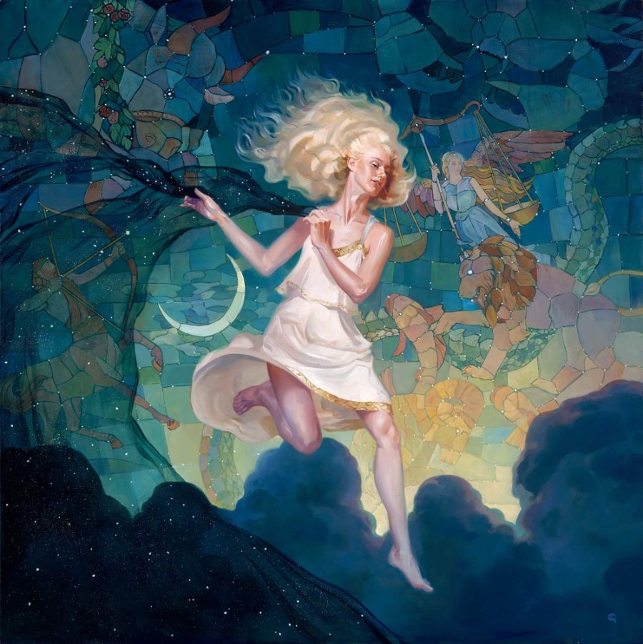
How did your art end up becoming showcased in the 2020 Llewellyn Astrology Calendar?
That was such a dream project for me. For years, I looked at that calendar and thought about working on something like that. I love that Llewellyn chooses different artists each year to take on the calendar. I think they just found my work to be a good fit for 2020, and reached out. But wow, what a dream!
What does it take to bring a larger scale project like that to fruition (labor, time, etc.)?
It’s a lot of coordination. My art director Lynne Menturweck was really great about helping to keep the palettes distinct. Llewellyn actually has in-house astrologers who are on hand to answer questions and give conceptual guidance. How cool is that? The project definitely required a lot of model coordination. Ultimately, a great deal of energy went into conceptualizing how each of these signs would manifest in a figure.
How does creating the imagery for a 12 month calendar differ from producing your many DC comic book covers?
They’re oddly similar, but I think the main difference is in how the subject is shown. In my calendar work, particularly for Llewellyn, I had to tease out the identifiable and relatable attributes of each month. Then I had to express each in a standalone image. In contrast, comic covers tend to be about a specific moment in the story that draws the reader in. Those covers are like a window that leads to a whole story, with action paving the way. Calendars are a little softer. The colors, the gestures, and the details of the subject draw the viewer in. Ultimately, my goal was to convey the experience of a particular season of the year.
My focus is on depicting people or those who they love in a scene set through my eyes. I integrate decorative, historical or otherwise imaginative settings.
The illustrations that you created for your astrological calendar and your ongoing travel/national park series with Anderson Design Group begin with live models. Are you always the person behind the reference shot lens, or do you hire a professional photographer?
Oh, it’s me! I’m definitely not a “photographer”. My shots aren’t anything special, but they serve as good reference to the subject in question, which helps speed the illustration process up a bit.
It seems like it’s no small feat to pull together a complete illustration project. What is one of the most complex gigs that you’ve ever worked on? What made it so time-consuming or otherwise challenging?
A painting I did for Paramount comes to mind. When the TV show “Yellowstone” first came out, I created a portrait of the entire cast. My god, that involved a lot of likenesses and a lot of back-and-forth with myself over what made a particular person really look like them. The most time consuming aspect of an illustration project is just zeroing in on what you need to pull something off the way you envision it. What colors, what composition, what pose, what paint texture – but that’s the fun part, too!
In your creative career thus far, which illustration job has been the most unexpected?
Perhaps portraiture. I’ve been taking on portrait commissions in recent years. My focus is on depicting people or those who they love in a scene set through my eyes. I integrate decorative, historical or otherwise imaginative settings. I’ve always wanted to do this type of project. Initially, I wasn’t sure how to seek out. When it actually started happening, that was a lovely surprise!
Your art has graced calendars, books, magazine editorials and comics for many years. Is it human nature to be somewhat desensitized to an ongoing achievement like that? Or do you still experience a rush whenever your art is officially unveiled for the first time?
Oh, it’s always exciting. When one of my paintings summons within the beholder a given story or period of their life that’s meaningful to them, that is especially inspiring.
In your ‘spare time’, you also teach 10 week long drawing and illustration courses for Seattle’s Gage Academy of Art. At what point in your 32 years of life did you figure out how to clone yourself? It seems as though being a couch potato is an utterly alien concept to you.
I love teaching! It came about as a way for me to recharge as well as engage in more conversations with those – like myself – who are also on a path of artistic development. I find it to be such a refreshing break from my painting work. Through teaching, I am also able to learn so much more about a subject.
Let’s have a bit of rapid fire fun, Kai.
- Art-geekiest thing you’ve ever done. God, every time I model for my own illustrations! I definitely think that qualifies.
- Name two fellow contemporaries who create art that makes you feel like a giddy little school girl. The textile artist Jane Jackson and choreographer Crystal Pite.
- What is your numero uno guilty pleasure? Snyder’s Sourdough Hard Pretzels.
- Which art supply/tool is well worth the ridiculously high price tag? A kneeling chair.
- Cheapest art hack that delivers excellent results every single time? A heavy steel straight edge with a finger guard. If you haven’t done it, trust me: NOT slicing off a chunk of your finger and bleeding all over your drawing is a pretty excellent outcome.
- Go-to music that never fails to get you artistically amped? Hildegard von Bingen.
- The most amusing thing about being an art teacher is: How hard words are.
- The most maddening thing about being a comic book cover illustrator is: Pursuing only one idea at a time.
- The coolest thing about having a clone is: Not having to actually dry the dishes after washing them – he does that.
- The best thing about being interviewed by Beautiful Bizarre Magazine is: Getting a chance to talk art with such awesome folks – thanks, BBM!
We’re going to wrap things up by chatting a bit about your reason for entering the Beautiful Bizarre Magazine Art Prize. Hit it!
I try to keep up on competitions and yearly periodicals, just to see what other folks are doing and stay plugged into what’s out there.
What do you feel you have gained from this experience?
So much awesome work comes through the Art Prize. Essentially, it’s a meeting place where art congregates. It’s been really inspiring to see how much this gathering of art multiplies interests and inspires all of us to seek out more work.
Would you recommend this art competition and encourage others to enter? If so, why?
There’s nothing better than an unexpected bolt of inspiration. When you get this much art together in one place, it’s bound to happen. More than anything, it’s a great way to stay in touch with your fellow artists while spreading your work and keeping us all inspired.
